
In previous article I showed You how to create fake doughnut using pie chart. It was nice, round and tasty. But what about data labels, when You got very big and very small data on the same chart? In today’s post I’m gonna show You how to data label on pie chart.

This article is continuation of fake doughnut. I will be using code to create the chart from there.
Let’s suppose now, that You know how to create pie chart and go straight to the data label topic.
Outside end position
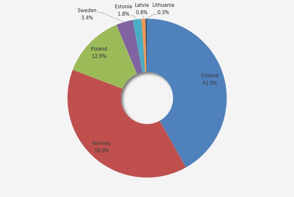
Property of .Position = xlLabelPositionOutsideEnd in most cases is probably the most convenient way to place the labels, but not always the best. One of that kind of situation is that one mentioned in the introduction.
In such case labels will be stacked.

You don’t want that. Really don’t. So what to do?
Best fit for data labels
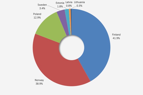
I found out that Excel comes in handy in case of labels positioning and supports user with .Position = xlLabelPositionBestFit. In short – choose the best position for the data label.
Unfortunately, this option helps You only in case of stacked labels, the rest of them puts inside the chart.
OK, now is better, but still bad. What now?
It might seem, that now You should only check which label is inside the chart and put it out. But any of them now is .Position = xlLabelPositionInsideEnd, inside and outside placed they are still .Position = xlLabelPositionBestFit.
So how can You recognize label positions?
Now You can start to thank your mathematicians from schools and regret your behavior like “why I need those equations and all these formulas”.
Now it’s time to use the Pythagorean equation!

Using that You can check if the data label further (hypo – hypotenuse) than the length of radius, so check if it is inside the chart or outside.
But how can You measure a and b variables?
Var b is just simply the difference between .Top property of data label and .Top property of chart center. Analogous situation with the second variable, You just need .Left property.
Knowing the parameters of the chart, You can also know middle point parameters, as we figured out in fake doughnut article.
    With .PlotArea
        x = .Left
        y = .Top
        h = .Height
    End With
Before You start your mathematical calculations first You need to get the data label object. You can for loop through them starting from first to the last one.
For i = 1 To .FullSeriesCollection(1).Points.CountOr go with for each. Just like You want.
For Each lab In .SeriesCollection(1).DataLabelsSo, it’s time to calculate the hypotenuse, where dt_left is .Left and dt_top is .Top property of data label.
hypo = Sqr((((x + h / 2) - dt_left)) ^ 2 + (((y + h / 2) - dt_top)) ^ 2)Also do simple calculation for diameter of the chart.
diam = (h / 2) + 5Why I would suggest You to at least + 5 to the length of the diameter?
I realized, that top left corner of data labels, in the IV quarter of the chart, are placed on chart circumference, or even little bit outside.
Why that top left corner matters?
Because of the .Left and .Top properties
So, if hypotenuse is bigger than chart diameter (+5) You know, that label is inside the chart and needs to be placed outside.
If hypo <= diam Then
    .Position = xlLabelPositionOutsideEnd
End If
Based on every information from paragraphs above additional code for pie chart, code should look like this.
For i = 1 To .FullSeriesCollection(1).Points.Count
    With .FullSeriesCollection(1).Points(i).DataLabel
        dt_left = .Left
        dt_top = .Top
        hypo = Sqr((((x + h / 2) - dt_left)) ^ 2 + _
(((y + h / 2) - dt_top)) ^ 2)
        diam = (h / 2) + 5
        If hypo <= diam Then
            .Position = xlLabelPositionOutsideEnd
        End If
    End With
Next
But, still not working. If You try that code going step by step, line by line, using F8 key, everything will work perfectly. Until You just press F5.
Sometimes it works, sometimes not.
You don’t want random working code.
Yes, I’m doing this on purpose. Trying to show You, what was my struggle with this. After couple of hours seeking the difference between those states of work I found out, that code doesn’t know which label/object to take.
So before any action connected with data label You need to point out that label.
On Error Resume Next
    .Select
On Error GoTo 0
Yes, macro needs to .Select the data label. This is the trick to proper work of this macro. Unfortunately You cannot avoid that, You could seen that without that the code was not working correct.
Put .Select inside error handling procedure, just in case.
The code
Option Explicit

Sub pie_as_donut()

Dim wb As Workbook
Dim ws As Worksheet
Dim ch_shape As Shape
Dim x As Long, y As Long, w As Long, h As Long, cd As Long
Dim i As Long, lab_var As Long
Dim circ As Shape
Dim hypo As Long, diam As Long, dt_left As Long, dt_top As Long

Set wb = ThisWorkbook
Set ws = wb.Sheets("donut")
Set ch_shape = ws.Shapes.AddChart2

cd = 80

With ch_shape.Chart
    With .ChartArea
        .Format.Fill.ForeColor.RGB = RGB(244, 244, 244)
        .Height = 300
        .Width = 450
        .Left = 100
        .Top = 100
    End With

    .ChartType = xlPie
    .SetSourceData ws.Range("A1:B8")
    .HasTitle = False
    .HasLegend = False
    .ApplyDataLabels xlDataLabelsShowLabel, , , , , _
True, , True, , vbLf

    With .FullSeriesCollection(1).DataLabels
        .Position = xlLabelPositionBestFit
        '.Position = xlLabelPositionOutsideEnd
        '.Position = xlLabelPositionInsideEnd
        .NumberFormat = "0.0%"
    End With

    With .PlotArea
        x = .Left
        y = .Top
        h = .Height
    End With

    Set circ = .Shapes.AddShape(msoShapeOval, x + h / 2 - cd / 2, _
y + h / 2 - cd / 2, cd, cd)
    With circ
        .Line.Visible = msoFalse
        .Fill.ForeColor.RGB = RGB(244, 244, 244)
        .Shadow.Type = msoShadow30
    End With

    On Error Resume Next
    ws.Select
    On Error GoTo 0

    For i = 1 To .FullSeriesCollection(1).Points.Count
        With .FullSeriesCollection(1).Points(i).DataLabel
            On Error Resume Next
                .Select
            On Error GoTo 0
            dt_left = .Left
            dt_top = .Top
            hypo = Sqr((((x + h / 2) - dt_left)) ^ 2 + _
(((y + h / 2) - dt_top)) ^ 2)
            diam = (h / 2) + 5
            If hypo <= diam Then
                .Position = xlLabelPositionOutsideEnd
            End If
        End With
    Next

    On Error Resume Next
    .ChartArea.Select
    On Error GoTo 0
End With

End Sub
Finally, summary
I know, it was a little bit long, but I think it was worth it. For me it was a long journey, hope for You will be only pleasure. Now You should not have any problems with correct positioning data label on pie chart.
Just wanted to say this is absolutely amazing work. I’ve been looking for YEARS on how to solve this ridiculous problem and you did it!
Thank You Jason, really glad that it helped 🙂